
Forms: Clickable Input Types
Forms are one of the main places of interaction for users of web pages and are a familiar part of our experience on the web. We use forms to collect different kinds of information through interacive user inputs.
These interactive inputs include email and password fields, checkboxes, buttons that we can click, and dropdown menus that allow us to choose from a series of options. Users generally complete a form by entering text, selecting items, etc. and submitting the form to a web server for further processing.
There are so many different things that we can do with forms. They are an essential part of any website, and of the most important web concepts to learn.
CHECKBOX
Besides the textual input types that we've discussed, we can have clickable input types. These include elements such as:
- checkboxes
- radio buttons
- dropdown menus
- submit buttons
You might see a checkbox if a form asks you to check an option if you want to stay logged in, after your browser session has ended, for example.
For that, we would use the input type="checkbox".
<input type="checkbox">By default, checkboxes are displayed unchecked, but we might want our checkbox checked to begin with. We do this by simply adding the attribute keyword of checked to the input tag, like in the example above. That's it, no need to add anything else. Just adding a single keyword here is that same as checked="checked". Which is repetitive, so we just use one attribute keyword, whenever this is the case.
We can add as many checkboxes as we like on a page, and we can check as many or as few of them as we like. We could say, have three checkboxes, for example, where we were asking on a hotel booking form if guests wanted to have breakfast, lunch and/or dinner. They could check all three, none, or one or two of those options.
The checkbox hack
There's plenty of cool stuff you can do with checkboxes that we will look at later on during the CSS section, including something called the checkbox hack, which is where you use a checkbox to control some other element.
So this could be something like when the checkbox is checked, it shows the nav menu or a sidebar, and when the checkbox is unchecked, have the menu or sidebar is hidden. I'll show you exactly how to do this in the CSS section of videos. But that is one cool and common example of something you can do with a simple checkbox.
Another would be using a checkbox to toggle dark mode on and off. In the example below, there is a lot of CSS happening, and the checkbox is hidden. Clicking the toggle, checks and unchecks the hidden checkbox. When it is checked, dark mode is triggered.
DATE, TIME, & COLOR
Date
In addition to checkboxes, we can add a wide variety of clickable inputs. For example, we can also add a date picker element to select a date of birth or a date to book a ticket for something. For this, we use the type="date" attribute.
The date input enables the user to enter a date, either using a text box, or a dropdown which is a date picker interface. The format for me is the UK date format, where we have it in the order of DAY/MONTH/YEAR. This may differ for you. In the US they have the format slightly differently, with the month preceding the day and year.
Time
Like a date picker, we can also have a time picker, which is very similar. Instead, we use type="time" which gives users the ability to enter a time. Perhaps for booking an appointment slot, or reserving a table at a restaurant, for example.
Color
An input type of color allows us to specify a color using one of the picker interfaces, or we can enter a color code into a text input field here in Hexadecimal, RGB, or HSL format.
<input type="date">
<input type="time">
<input type="color">
So, what we are seeing, is that these are all the same HTML element – an <input> element, and we are getting a huge amount of variation. The only thing that changes is the type attribute. So if we have type="checkbox", you get a checkbox. If type="file", you get a form input through which you can upload a file, and so on.
RADIO
The radio input is similar in some ways to a checkbox, except when presented with more than one option, you can only select one of those options at a time. In a series of checkboxes, you could check as many as you like. In a series of radio buttons, you can choose only one option.
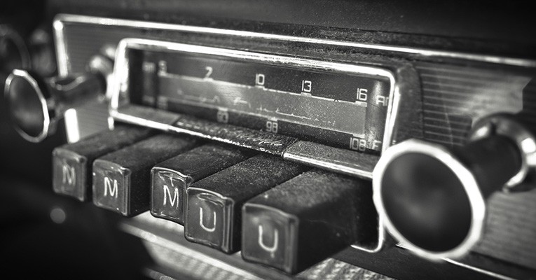
They are known as radio buttons because they look and operate similarly the pushbuttons on old-fashioned car radios, where a single button is pushed at a time. So you press a button and the one previously selected would pop out.
The radio buttons in HTML work in a similar format - they allow the user to choose only one of a predefined set of options.
To create a radio button, again we use an <input> element with a type="radio". We typically label our radio buttons to indicate the choice that the selection represents. In the example below, I will create a set of simple radio buttons to choose yes, no, or maybe. We label each radio input with "Yes:", "No:", and "Maybe:", ensuring that the label is programmatically linked to the radio input. We can do this by using matching for and id attributes, or we could nest the radio button inside the <label>.
Name
To make our radio buttons operate as we expect, ie. selecting one, automatically deselects the other, we link the two radio buttons by giving them both a shared name attribute. In this case, we will just say something like name="choose".
<label for="radio-yes">Yes:</label><input type="radio" id="radio-yes" name="choose">
<label for="radio-no">No:</label><input type="radio" id="radio-no" name="choose">
<label for="radio-maybe">Maybe:</label><input type="radio" id="radio-maybe" name="choose">You will notice that we can only select one radio button at a time. We could have 10 or 100 or 1000 radio buttons linked with the same name and you would only ever be able to select just one.
A page may contain as many groups of radio buttons on a page as you like, as long as each group has an identifying name which links them as a related set. We have this one named choose. We might have another asking people their preferred method of contact, say phone, email or post, or another asking if they are over 18 or under 18.
Value
Radio buttons can also take a value attribute, which tells us which button was selected when the form is submitted. So to our buttons, we might add values of “yes", “no" and “maybe".
The value attribute can be added to other input elements too. Not just to radio buttons. If we go to this page at W3Schools, we see for text-based input elements, value defines the initial value in the text field, but for buttons and submit inputs, which we will come to shortly, it defines the text on the button - click me! For example, On radio buttons and checkboxes however, it defines the value associated with the input (and this is also the value that is sent when the form is submitted).
DROPDOWN
The dropdown menu works a little differently to the others in that it is not an <input> element, but a select element. The dropdown is nested inside the <form> element just like the other elements we've seen, and we use<select></select> tags. Within these, we nest <option></option> tags which specify the options in the dropdown menu. So they are constructed in a very similar manner to list elements.
<label for="select">Select your favourite form input:</label><select name="select"id="select"><option value="email">email</option><option value="password">password</option><option value="color">color</option><option value="checkbox">checkbox</option><option value="radio">radio</option> </select>Here, we will are asking the user for their favourite input elements. First, we will bind a label to the select element using the method we have seen of giving the label a for="" attribute and the select an id="" that matches.
Then we add some option tags for each dropdown choice we want to add. We need a value and some text on the page. Usually, I have both of these the same, but you don't need to. Having them the same makes it easier to understand the selected choices when the form is submitted to the backend.
When we make a <select> list, we have a default choice which is always whatever the first option tag is. Our list always shows the first option selected by default. But what if we wanted to override that and have one of the other options by default?
Well, it's easily achieved by adding the keyword selected to one of the other options. Just adding the keyword selected is the same as adding selected="selected". Where the value and the key are the same, we can use a single keyword.
SUBMIT
We now come to the last input type we will look at for now and that is the submit input type which is rendered by the browser as a button. When the click event occurs on the submit element (typically because the user clicked the button), the user agent attempts to submit the form to the server.
Input elements with type="submit" have an additional value="" attribute which sets the text on the button. If we were to leave this attribute blank, or not add the attribute at all to the submit input element, then by the default text on the button will be ‘Submit'.
<input type="submit" value="Click Me!" >HTTP 405
If you try to post form data to a location that don't have permission to post to, you will get anHTTP 405 error when the form is submitted. The HyperText Transfer Protocol 405 indicates that the request method is known by the server but is not supported by the target resource.
The 405 error occurs when a form tag has a POST method, and the location specified in the action, cannot or will not receive the form data.
In the CodePen below, I have set the location in the action as https://www.bbc.co.uk. Of course, we do not have permission to post data to that location, so the BBC will also return us a 405 error.
Try submitting the form and see what happens. You don't have to use a real email and password. Make something up. As long as it follows the usual email format of name@email.com then it will work.
So the easiest thing for us to do as we do not have anywhere for our data to go while we are working with just HTML is to remove the action and method attributes. Once we are more comfortable with JavaScript later on and have some fully-functioning forms, we will introduce these attributes again.
Removing the action and method attributes means that when we press submit, the form simply refreshed the page and removes any data.
Which is essentially the function it would normally produce – ie returning the form to its blank state and moving the data out of the front end.
Reset
Another type of button we can use is a reset button created by an input with type="reset". We would simply use this element to reset or clear any information that has been entered into a form.
Like with submit, the value attribute controls the text that will be on the button. By default, the text on the button will be 'Reset'.
W3Schools say to avoid reset buttons in your forms as it can be frustrating for users if they click them by mistake after entering lots of data into a form.
GROUPING FORM CONTROLS
We can also group logically related form inputs and labels by using using the <fieldset> and <legend> elements.
Grouping form elements into sections or sets makes it easier for our users to locate a given input, which makes the form more user-friendly.
<form><fieldset><legend>Contact Details</legend><label>Email Address:<input type="email"></label><label>Phone Number:<input type="text"></label></fieldset></form>FURTHER RESOURCES
- W3Schools: HTML Forms
- W3C: Forms in HTML
- MDN: Your first form
- MDN: How to structure a form
- MDN: The form element
- MDN: Web forms — Working with user data
- W3Schools: Form Input Types
- MDN: The Input (Form Input) element
- W3Schools: HTML Form Attributes
- W3Schools: The Input value attribute
- MDN: The Field Set Element
- Why You Should Avoid Tables for Web Page Layouts
- The checkbox hack
- CodePen: Pen for Forms (1): Text, Email, & Password Inputs
- CodePen: Pen for Forms (2): Clickable Inputs - Checkbox, Dropdown, Radio, & Submit
- CodePen: Pen for Forms (3): How to Build a form from start to finish (unstyled)
- CodePen: Pen for Forms (3): How to Build a form from start to finish (styled)